HomeSwitch
Overview
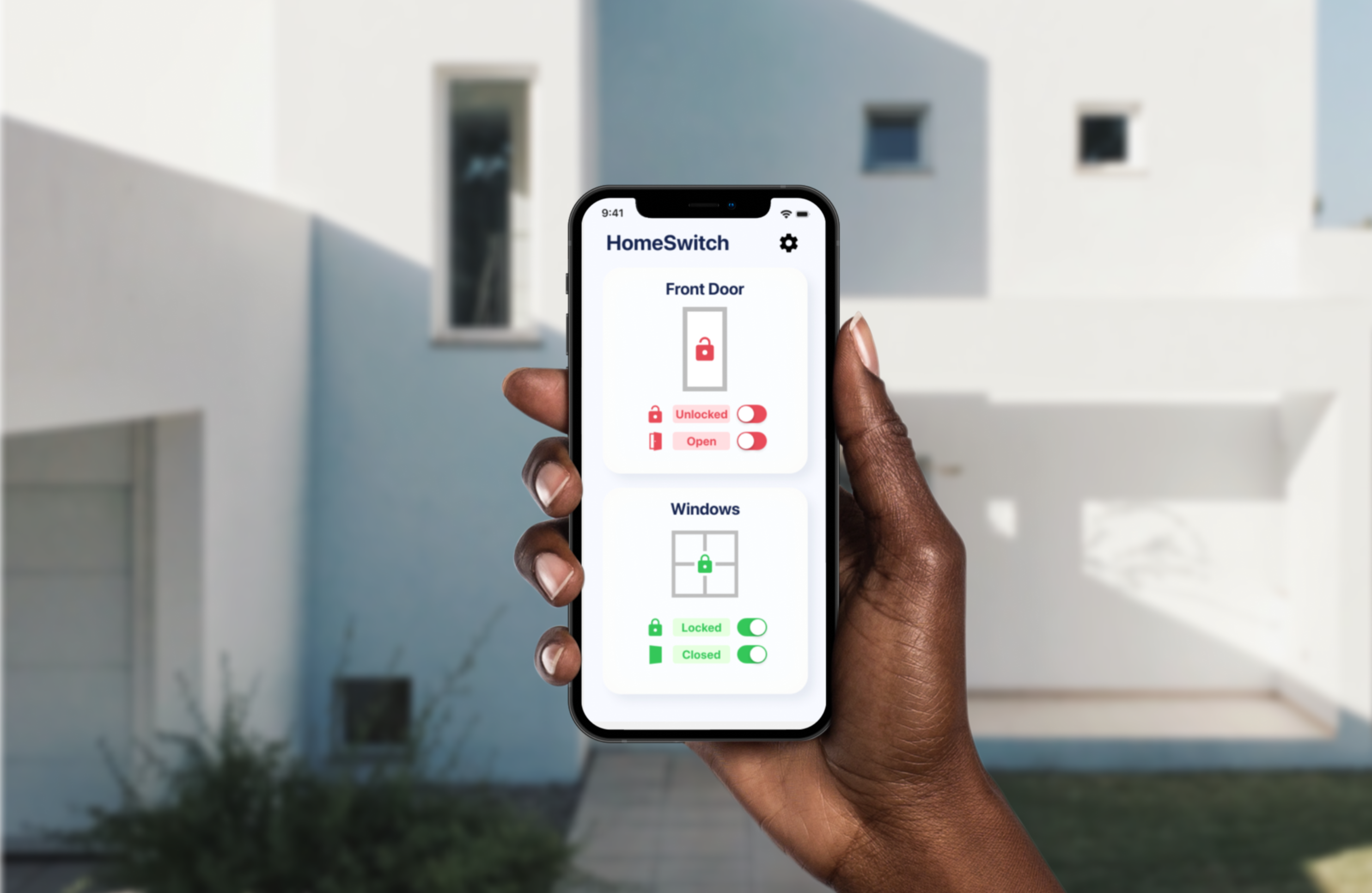
HomeSwitch is a concept smart home app designed to make smart home technology simpler and more accessible for the elderly population. This concept accounts for robust smart home equipment that may become more ubiquitious in the future, including doors and windows that can open and close with the tap of a button.
Tech Stack
Figma Design Tool
Xcode IDE
Swift Programming Language
SwiftUI Modern Interface Framework
Year
2021
Process
Problem Statement
Smart home technology is designed to make the home experience simpler and easier for people of all ages. However, smart home tech is not widely adopted by the elderly population due to friction with signing up for accounts and setting up products. People in this population report steep learning curves and resentment to learn new technology. This makes it more difficult for elderly people to enjoy the benefits that an automated home could bring.
Usability Testing
After researching the problem and developing a clear, succinct problem statement, I created a hypothesis for a potential solution. After creating an initial prototype, I put the prototype in front of users to conduct user testing. For these tests, my goal was to learn how my solution would fit into the target user's life or digital life so that I could further refine the user experience of the companion app.
I conducted a moderated, remote usability test over Zoom, and asked the participant a few questions to gain more insights.
Questions for Usability Testing Participants
- What advantages would using a physical remote have over using a smart device companion app?
- When would you find it most useful to be able to control your windows and doors remotely?
- What kinds of visual cues in the app helped you to control the doors and windows?
- Which app elements were distracting or unclear in their purpose or use?
- In which situations could you see yourself interacting with this system most often?
Changes based on User Feedback
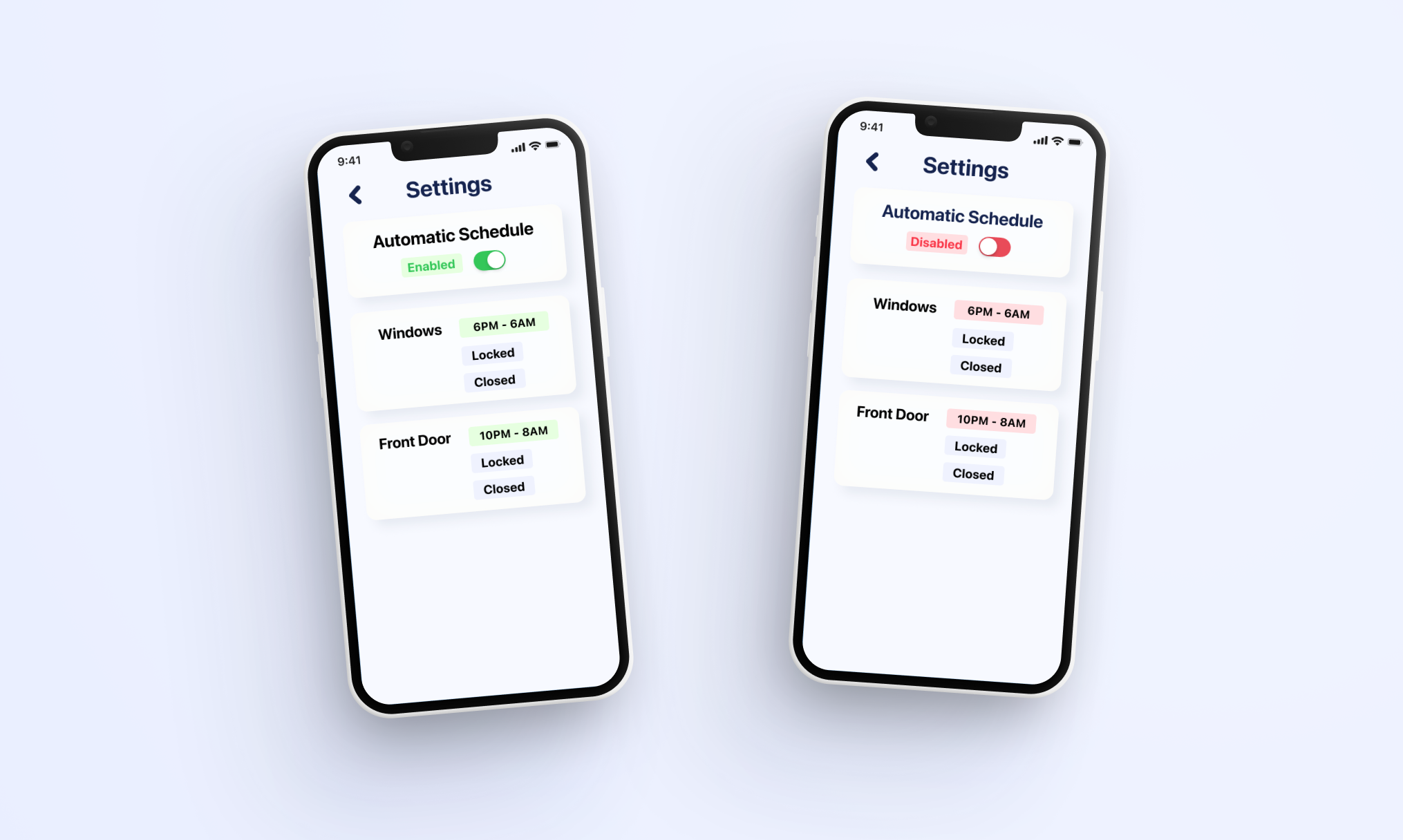
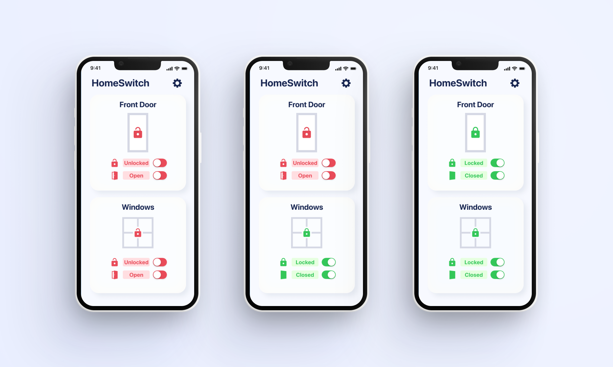
Based on the feedback, I learned that the color scheme and app graphics could be improved, and that a better visual preview of each door or window would add to the entire product’s continuity. The automation setting seemed to be the most unclear, and it seemed like adding the current schedule would increase clarity and allow users to check all important info on one screen.
For my next design iteration, I made a number of modifications based on this feedback:
- Increased icon size and status text size
- Improved visuals for windows and doors
- Decreased saturation of red labels and button color, shifted to more of a pink/red hue to remove the feeling of a sense of urgency to flip the switch to green
- Changed mono font for a more consistent look
- Added rounded corners to system status indicators
- Removed the black background behind system status labels to increase legibility, visibility and contrast
- Changed ‘Automation’ title to ‘Automatic Schedule” to make it clearer what this section is controlling
- Refined the spacing of UI elements to ensure proper alignment